The Importance of Colors in Animation

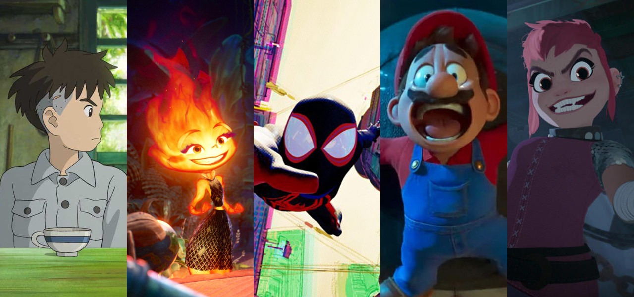
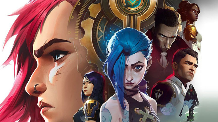
Universal Pictures recently released a trailer for their upcoming film, The Super Mario Bros. Movie. Though the reception towards Chris Pratt voicing Mario (what were you thinking, Universal Pictures?!) was negative, the teaser was highly praised for capturing the colorful world of the popular video game franchise.
But do you think the reaction would’ve been as pleasant if the trailer had been in black and white?
Nein.
Colors play a significant role in an animated video, whether it’s being made for a multi-billion-dollar film production studio or a recently established business. And people often take this for granted, failing to acknowledge that there’s a whole process behind the selection of colors.
Shedding light on that very concept, in this blog, we’ll talk about the roles color play in animated videos.
So, stick around, and you’ll learn a thing or two.
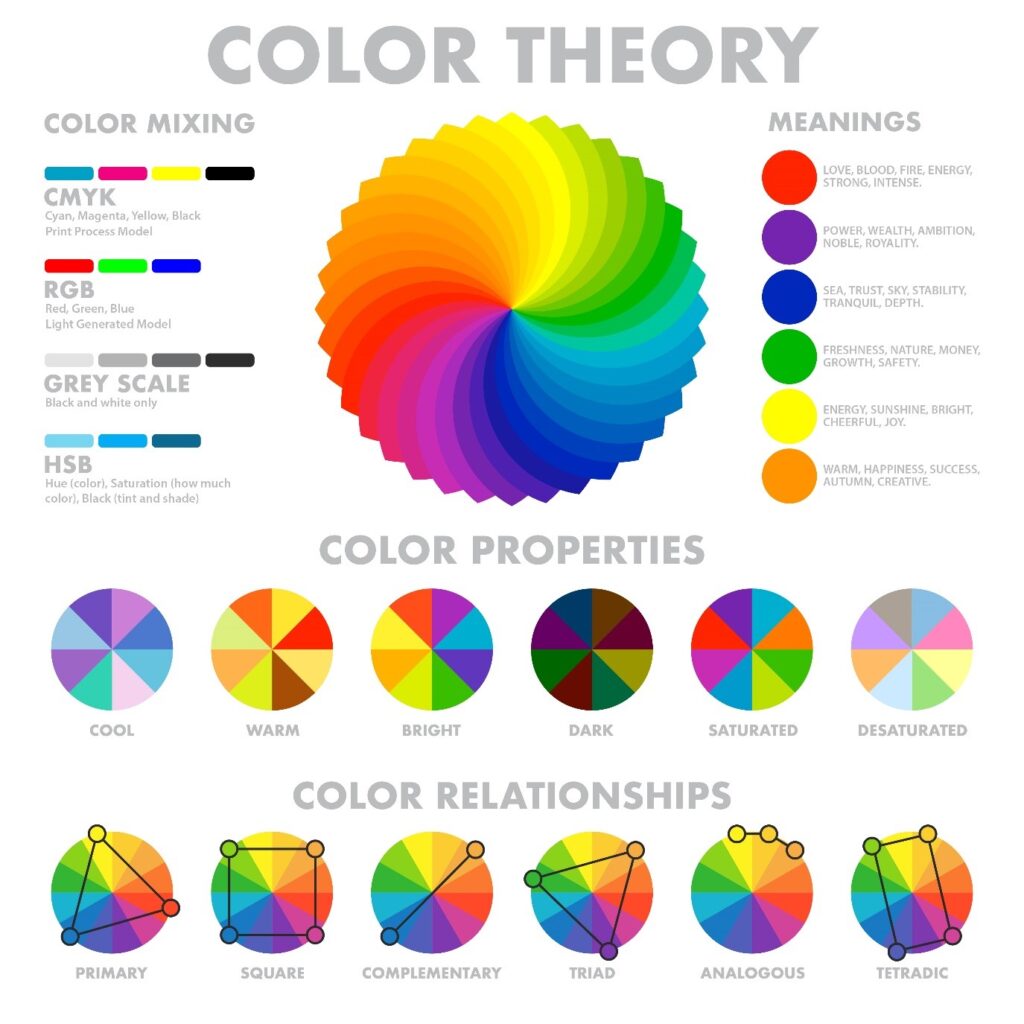
The Application of Color Theory in Animation
English mathematician Isaac Newton, one of the most influential figures in the world of science, is famous for formulating the theory of gravity.
What most people don’t know is that he also invented the color wheel – a diagram consisting of different colors Sir Newton categorized as:
An integral part of the color theory is a few rules. Although they were developed in 1666, animators today find them immensely helpful while making animated videos.
According to the rules, the colors that go well together can be divided into three groups:
Complementary colors sit on the opposite side of a 12-color wheel, like yellow and purple, blue and orange, and yellow and green. They are entirely different from each other in contrast, which proves helpful when you want your video to pop up.
Analogous colors are three colors located side by side on a 12-color wheel, such as yellow, orange, and red. Since they’re similar, animators use them when they want one of the three colors to dominate while the other two support it.
On a standard 12-color wheel, it would form a triangle if you selected orange, purple, and green. Any three colors choosing which will form a triangle are called triadic colors. Although they have different contrasts, triadic colors can help create a bright yet subtle video when used creatively.
Now that you know the basics of color psychology, let’s look at how different colors affect viewers.
The Symbolism Behind Different Colors

Intense, aggressive, and energetic, red immediately makes your heart beat faster. It’s one of the most dynamic colors, often eliciting two entirely different responses.
For instance, on the one hand, it’s associated with passion. But on the other, it represents vengeance.
So, if you’re making an animated video that urges viewers to respond quickly, remember to include red, but in a sophisticated way.
We’re saying this because if you use too much of it, it’ll cause viewers to get anxious.

Have you ever wondered why most yoga studios are painted white?
It creates a sense of purity, cleanliness, and tranquility, which is precisely what the color white is about.
An excellent quality of white is that it complements almost every color. Because of this, you’ll find many brands that use the color in their logos, such as:
In the marketing world, brands use whiteboard animations o simplify challenging concepts.
(Also Read: 6 Free Tools You Can Use to Create Attractive Animated Videos)

Yellow is cheerful, optimistic, and confident, as evident from the logos of Snapchat, Lay’s, and Ikea. But you’ll notice that none of them are entirely yellow; instead, they’re complemented by other colors, like white, red, and blue, respectively.
That’s because yellow alone can overwhelm viewers and cause eyestrain.
Therefore, if you’re using it in your animated video, remember to include other colors. This way, it’ll make viewers feel cheerful without being annoyed.

Black is often considered the evil twin of white, evident from the countless villains in films and TV shows wearing the color. But that’s not true; it symbolizes power, elegance, and authority.
That’s why so many high-end brands have black logos, like Chanel, Apple, and Louis Vuitton.
So, if you run a company that sells expensive items, consider using black in your animated video; it would help establish yourself as an industry leader.

Did you know that artists wait in a green room before giving a performance or appearing on a talk show? It helps them remain calm and relaxed.
The same psychology applies to animated videos. And brands that serve the health, wellness, and fitness industries leverage this to their advantage. Although the company’s ads and websites feature multiple colors, green is a dominating part.
Even the giant audio-streaming service Spotify uses green, so people can heal while listening to music.

Walk into any room with blue-painted walls, and you’ll start feeling safe, as if you’re home. That’s because the color is associated with trust. In fact, that was the exact reason why Mark Zuckerberg, the owner of Facebook, chose blue for the company’s logo (which is ironic considering Facebook was accused of sharing data with third parties).
The great thing about blue is that it’s quite versatile.
If you’re aiming to build trust with your audience, use lighter shades. And if you want to appear professional, select darker hues of blue.

Primarily associated with love, pink elicits feelings of romance in viewers. Although the internet would have you believe it’s only for girls, there’s no truth to that statement.
For instance, your favorite brands, Dunkin’ Donuts and Baskin Robins, also have shades of pink in their logos. And as far as we can remember, everyone can eat donuts and ice creams, regardless of their gender.
With that said, if your target audience is female, there’s no harm in using the color in your animated video.
After all, women have an innate desire to like pink, according to research conducted by Current Biology.
That’s All from Our Side
The next time you see an animated video, pay attention to the colors. You’ll notice that each of them has been carefully selected – small parts that add to a beautiful, enthralling, and worth-sharing outcome.
The animated videos we create at AnimationProLabs produce the same results. They’ll draw your viewers’ attention with an engaging storyline and stunning visuals while delivering your brand’s core message.