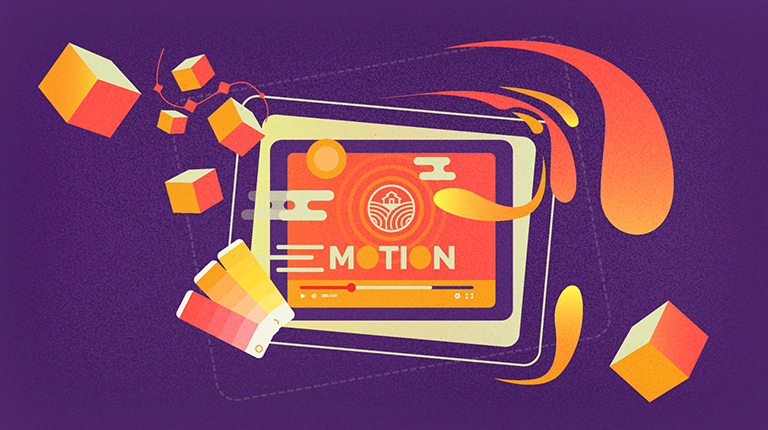
11 Animated Logos with Hidden Meanings to Get Inspired From
Animation is not the art of drawings that move but the art of movements that are drawn.
Norman McLaren
Logos are the window to your brand. They don’t just introduce your customers to you but tell a story and the aim of why you started.
However, the influx of several brands in various industries has slightly marred the significance of logo design. After all, less variety and repetitive designs can only do so much. Yet, something did revive the logo art – animated logos.
Animated logos depict the art of motion graphics and colorful symbology to bring life to a logo.
Not only are they visually appealing, but they also make it all the more exciting for brands to compete against one another. And since 57% of business owners tend to allot $500 to logo design, it’s clear that the competition will only get tougher.
Other reasons companies and customers have come to love animated logos are because they:
Creating an animated logo is fun. But you must remember that it’s just a sneak peek into your brand’s story, not an entire movie itself.
So, keep your logo animation not more than 10 seconds long.
Any more than that, and you might as well drive a viewer away. Why? Because the actual content gets washed off while waiting for the animated logo to stop moving.
Where can you use animated logos?
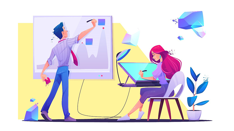
Now that you know the what, how, and where of animated logos, it’s time to take a good look at some that hide a deeper meaning within. Who knows, they might awaken your creativity. 😉
Top Logo Animations to Pump Up Your Creative Juices
Chamelo
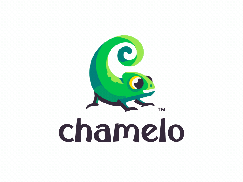
If there’s one thing that makes kids eat their cereal, it’s a mascot sticking out from the box. And that’s why famous cereal companies like Frosted Flakes and Cheerios have one.
Chamelo’s animated logo was born out of the same context. Although not a cereal brand, it’s enough to make heads tilt in curiosity, especially with the cheeky wink the chameleon gives.
The best part? It’s simple, colorful, and doesn’t take more than five seconds before the animation completes.
Spotify
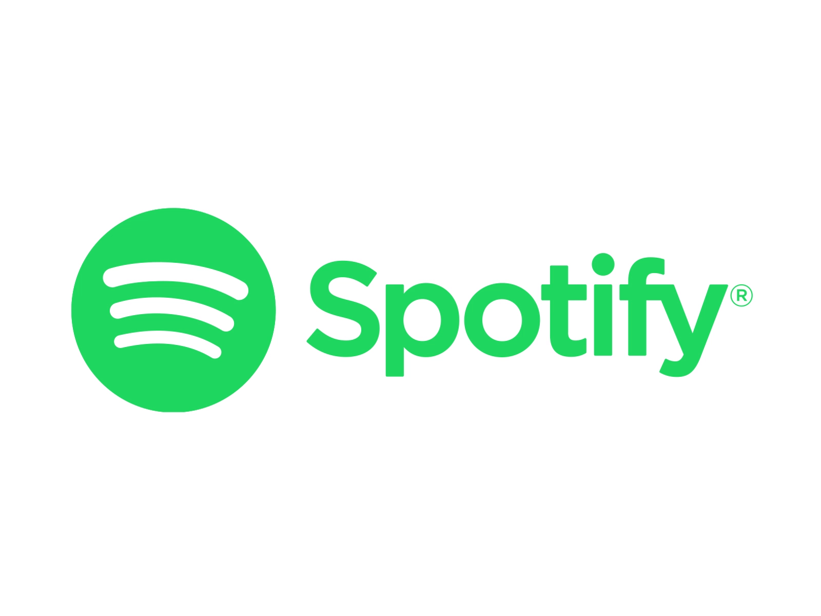
Gone were the days when people relied on iPods and MP3 Players to listen to music.
Brands like Spotify have brought a revolution by giving people the chance to listen to millions of songs in a single app. And although Spotify introduced an overly simplistic albeit static logo at its inception, the current one is anything but.
Crowned with three curved lines that indicate Wi-Fi or internet connectivity, Spotify’s animated logo packs the service they provide in a single motion.
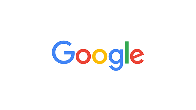
It wouldn’t be wrong to say that Google was one of the first few that introduced animated logos to the world – in the shape of Google Doodles.
They took things to the next level with the Speak Now animated logo. The visuals don’t just appeal aesthetically but also give a clear but quick insight about what to expect from the brand.
Starting with the brand name, it transitions to four bouncing dots in the brand’s colors forming:
Meta
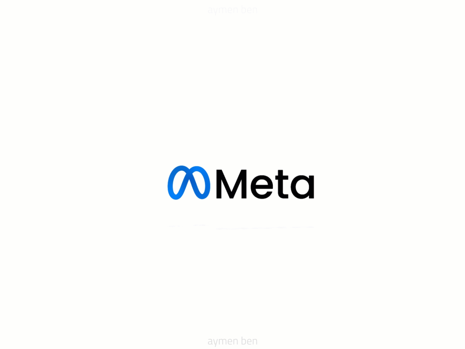
The famous social media networking site Facebook morphing into Meta was the highlight of the year 2022.
Even more interesting were the allegations against its ripped-off logo design. Shaped as the Infinity loop, the official statement said they wanted to signify the transition into the ‘beyond’ aka the Metaverse.
So, why have we included Meta’s animated logo as something you can take inspiration from? Because of the sheer simplicity that the logo presents.
Rocketgraph
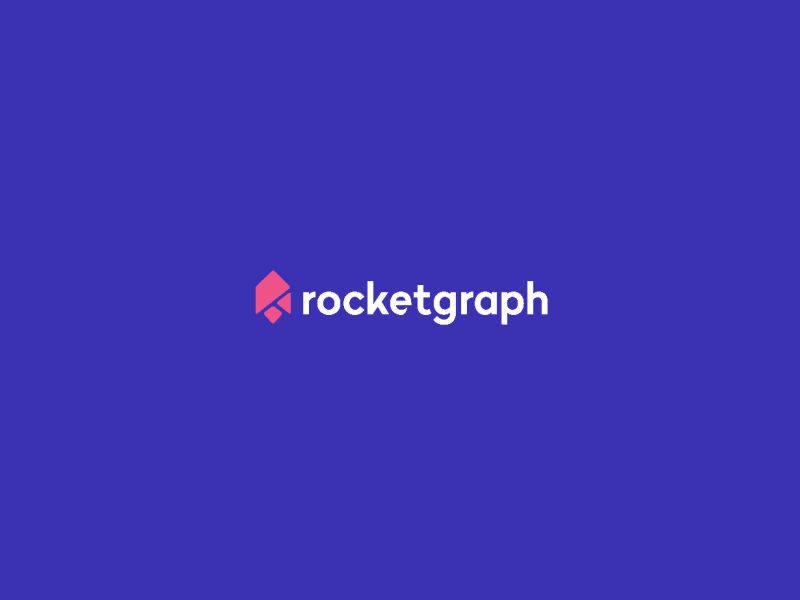
An animated logo won’t exist if it weren’t for a static logo created initially. And animated logos like Rocketgraph truly represent that.
It’s the perfect combination of motion graphics ending with a static logo. The visual treat the entire animation presents is totally worth it.
Skype
As a common mode of communication in the corporate world, Skype has worked hard to give competitors like WhatsApp a tough fight. Its animated logo is a successful attempt at staying attuned to the changing times.
Skype’s animated logo makes excellent use of the negative space with bubbles flying together to form a cloud.
FedEx
FedEx is a leading courier service that needs no introduction. The logo animation is a class apart, which tells what they do: Pack, ship, and deliver.
The takeaway from this animated logo is that even if your company has worldwide recognition, it never hurts to let the message sink in.
And what better way than to make clever use of your static logo?
Sello
This animated logo is another example of less is more. So, while you see the first four letters standing still, the O draws all attention.
The brand is an eCommerce management platform for businesses to sell what they want. And that’s the picture the letter O tells. It switches between:
Of course, it’s not a complete list of things to sell on the platform, but it’s enough to get the message delivered.
Burger King

Burger King rebranded its logo after 20 years.
The logo, while being a modified and more stylized version, doesn’t differentiate much from its predecessor. However, the animated logo makes it stand out.
Made with a 3D effect to appeal to the audience, it succeeded because people couldn’t stop talking about it for quite a while (this blog is an example, too!).
Keeping your brand afloat is challenging, with giants like Facebook and Instagram doing rounds on the internet. And yet, as a site aimed at professionals, LinkedIn has touched cornerstones. The prime contributors to LinkedIn’s popularity are its easy job-search model and e-learning courses.
The platform also maintains a dignified stance to display its unique identity on the web. Their animated logo is no different.
All in all, it gives one clear message: it’s no place for wannabes.
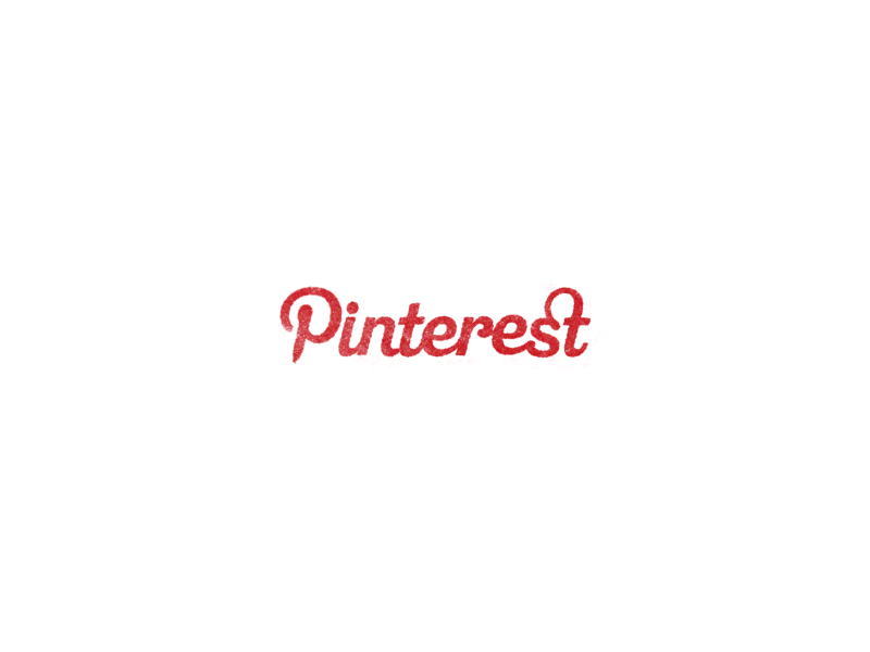
The world transitioned towards an all-visual and aesthetic appeal before we knew it. And Pinterest has played a vital role in fueling creative minds.
The logo animation starts and ends with a bang, with just a pin doing all the work.
Since the entire concept of the Pinterest platform is based on pinning images to a board, they’ve used the same here. A pin forming all the letters of the brand to rest as a t.
Final Word
With big names like Google, Meta, and Spotify creating animated brand logos, it doesn’t take a genius to understand that animated logos are here to stay.
But it does take a professional like AnimationProLabs to create one that brings your brand to the spotlight.
So, reach out to us and find all we can do for you!